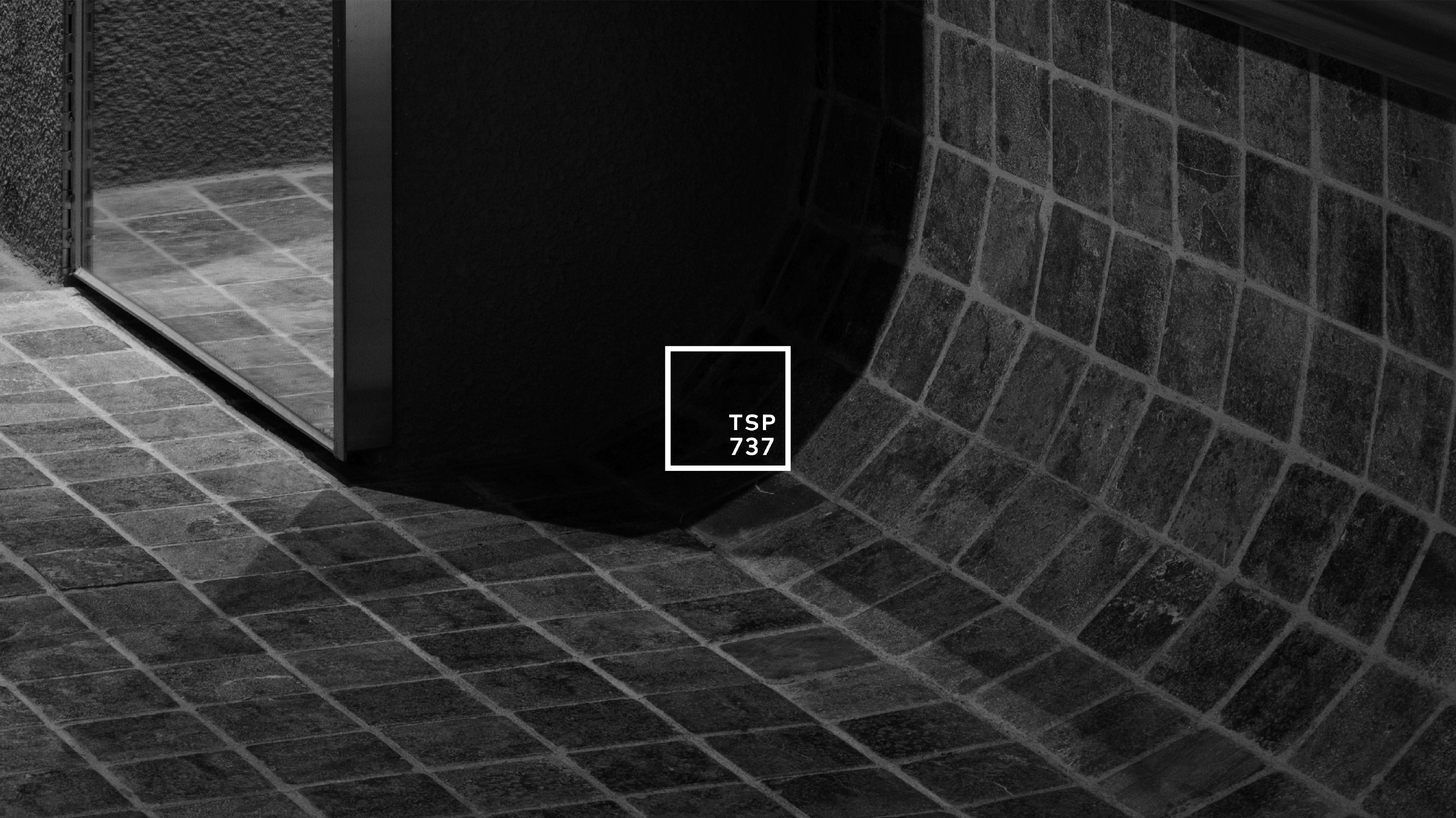
TSP 737
Art Direction & Design
-Brand Identity
-Package
-Printed Material
-Store Identity
-Brand Identity
-Package
-Printed Material
-Store Identity
Design by
-A TWOSOME PLACE
Design Team
-CFC
-A TWOSOME PLACE
Design Team
-CFC
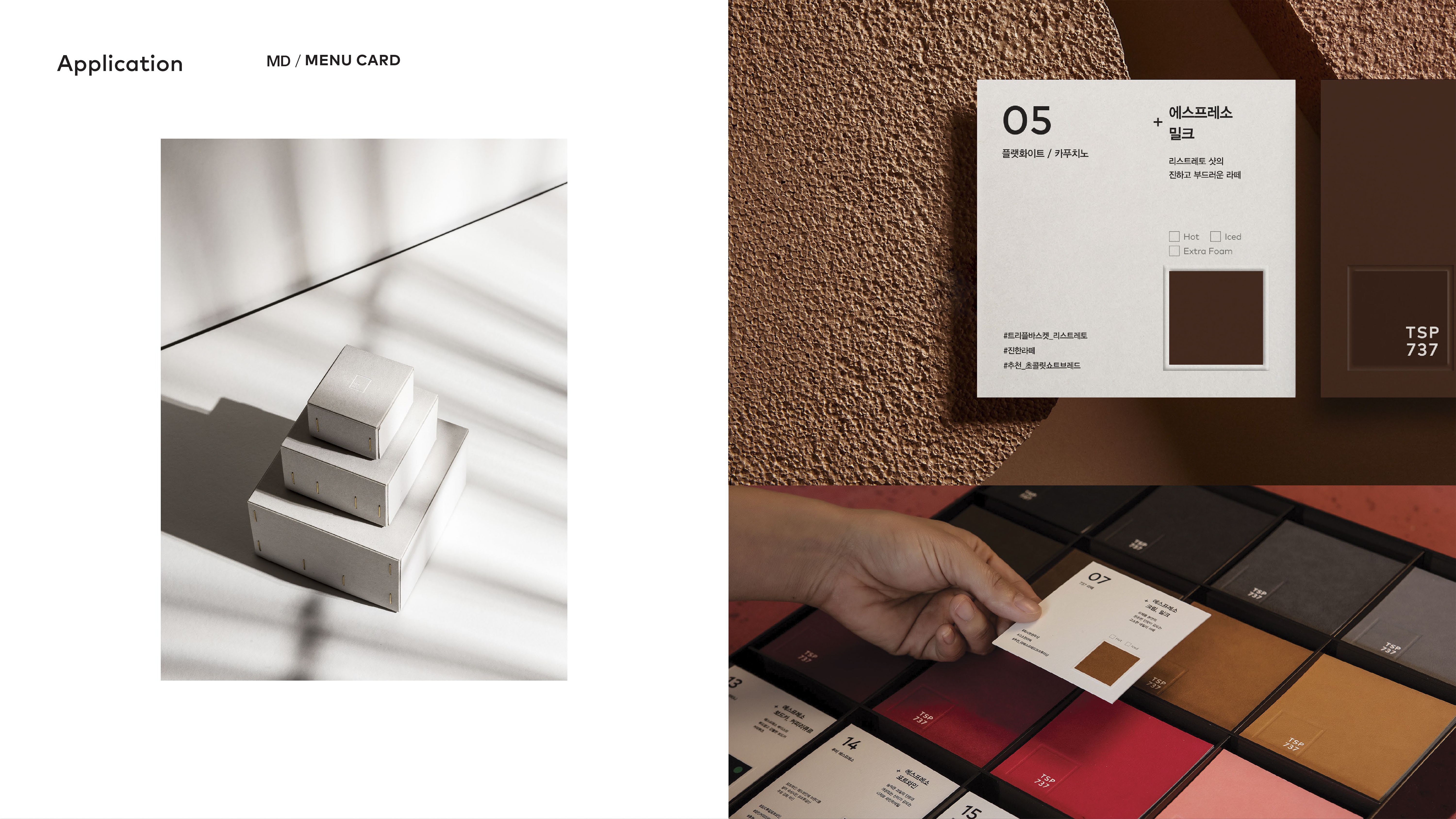
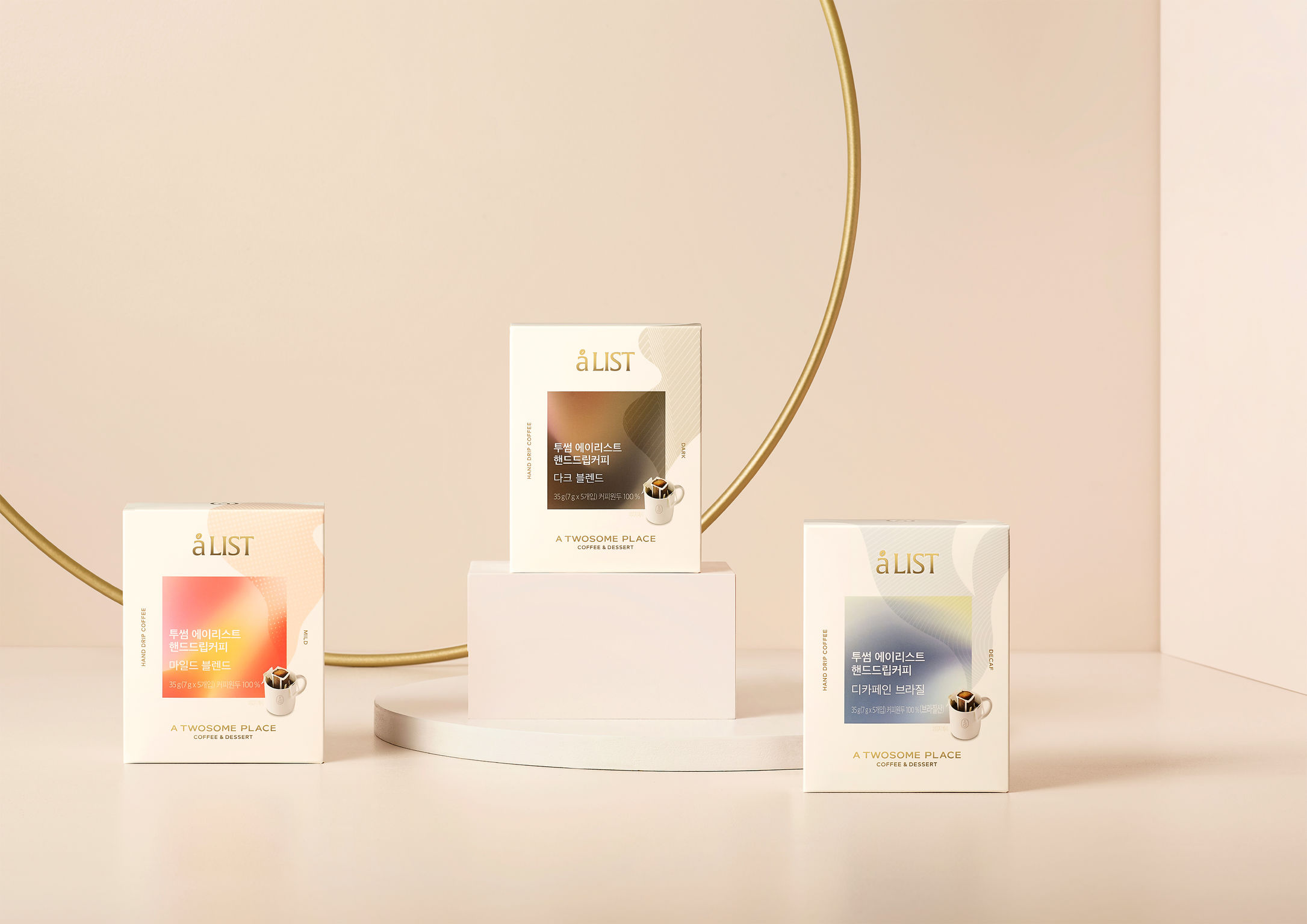
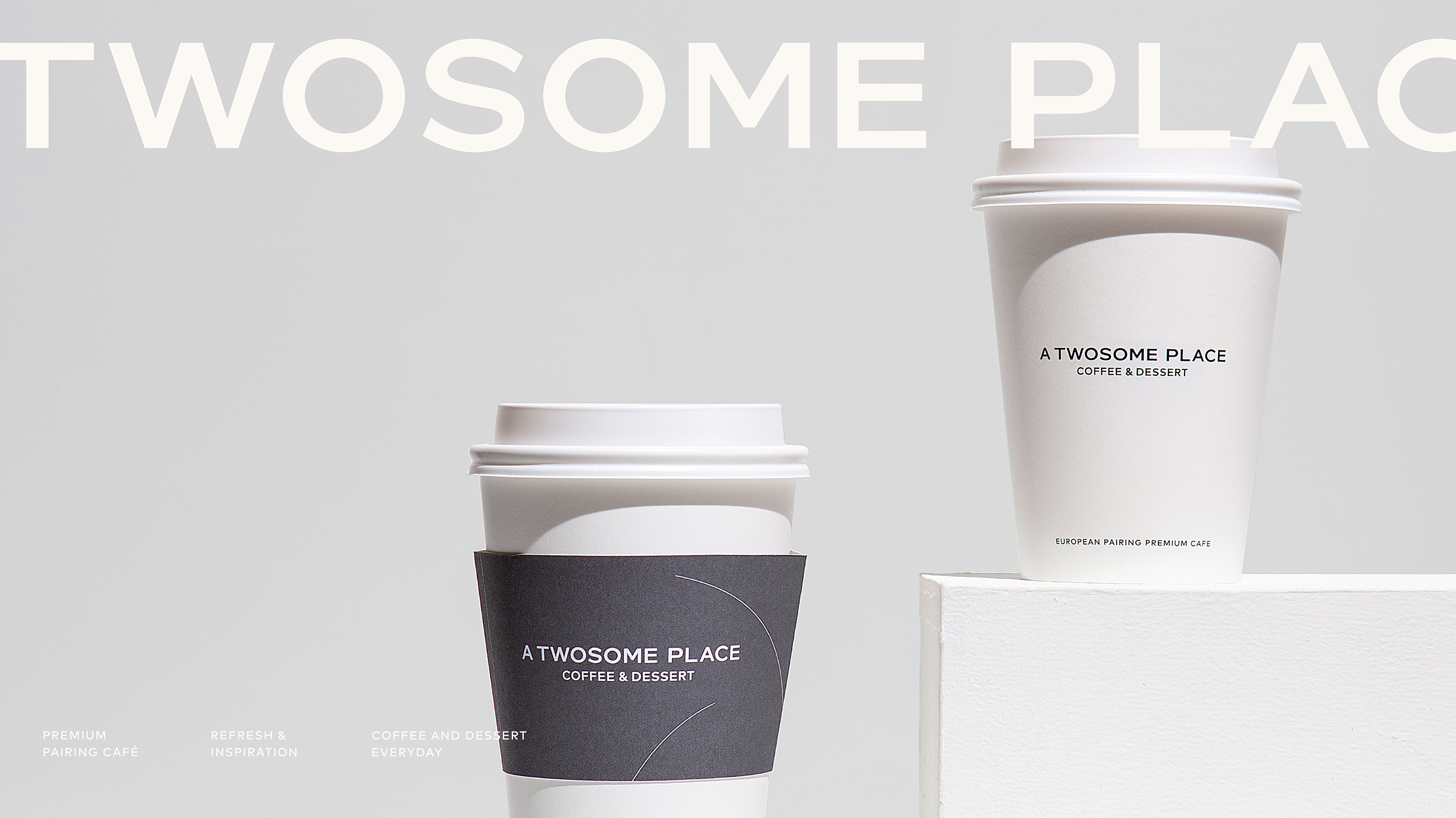
Korea's leading franchise cafe, A TWOSOME PLACE, has updated the packaging design for its drip coffee in different formats. The brand wanted packaging that helps product expandability in various categories through the use of color, shape, and patterns in a logical graphic system. A gradient square is used to identify the product across categories and stores. A range of colors differentiates various product types. An overarching tone, style, and logical graphics unify the product range.


Seasonal Stick Coffee
-Package
-Printed Material
-Printed Material
Design by
-A TWOSOME PLACE
Design Team
-A TWOSOME PLACE
Design Team
Korea's leading franchise cafe, A TWOSOME PLACE, has updated the packaging design for its drip coffee in different formats. The brand wanted packaging that helps product expandability in various categories through the use of color, shape, and patterns in a logical graphic system. A gradient square is used to identify the product across categories and stores. A range of colors differentiates various product types. An overarching tone, style, and logical graphics unify the product range.

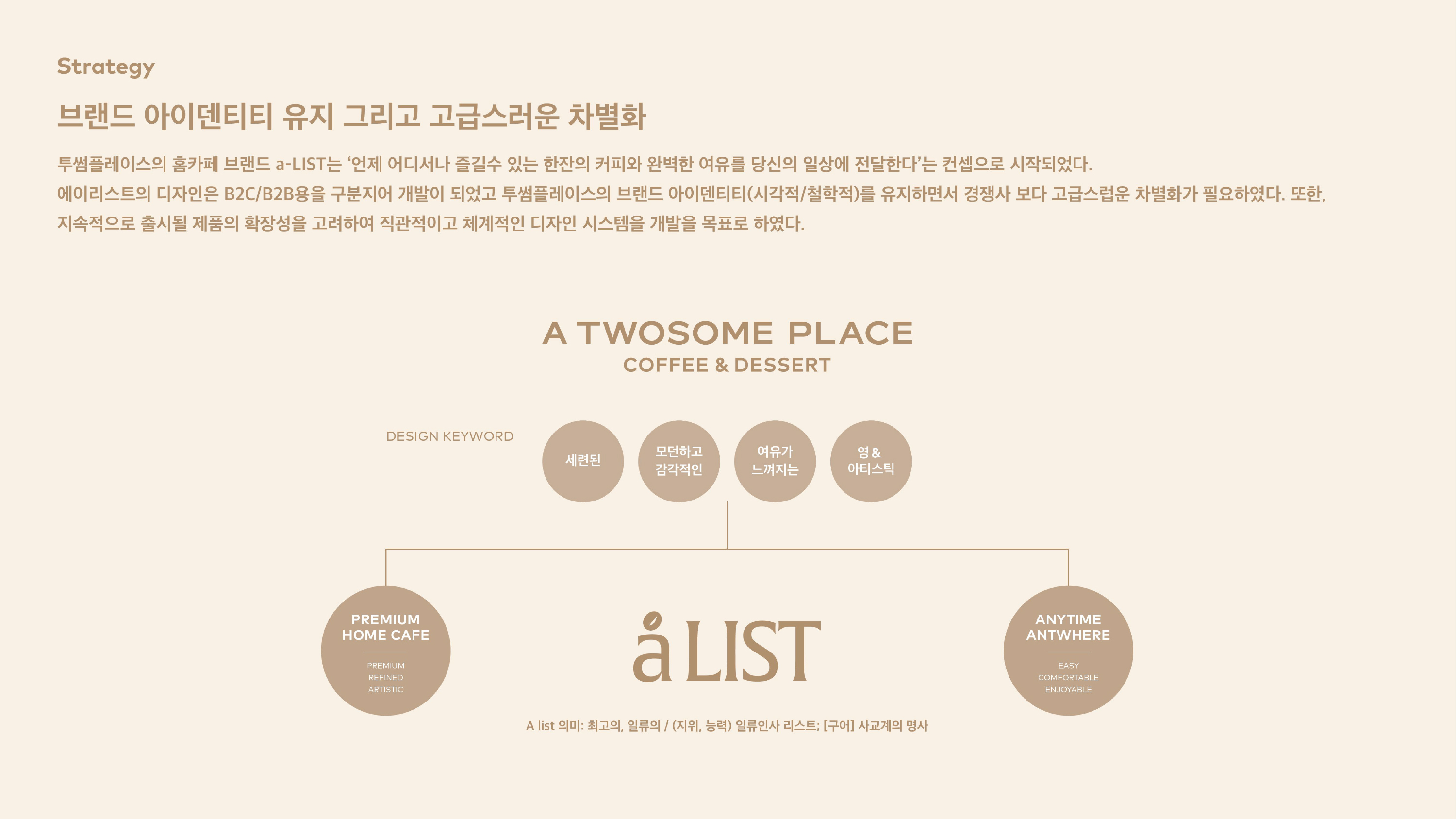
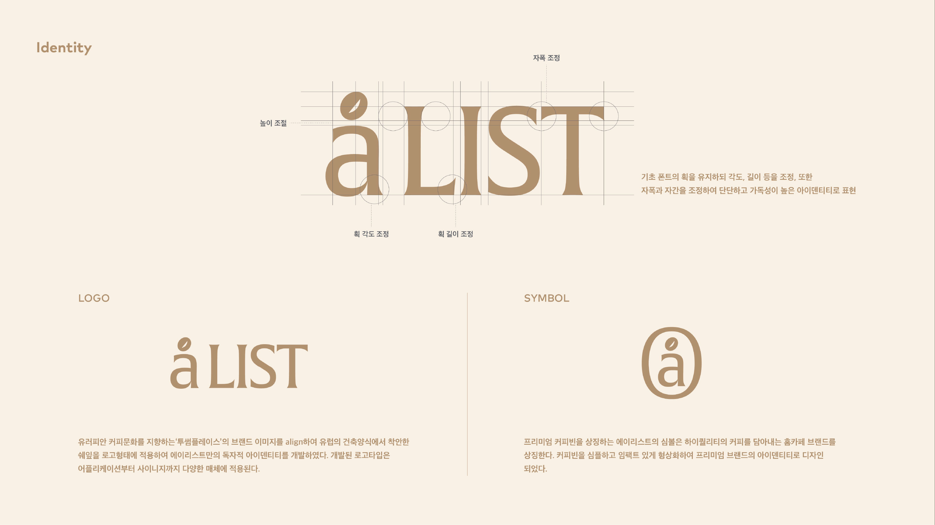
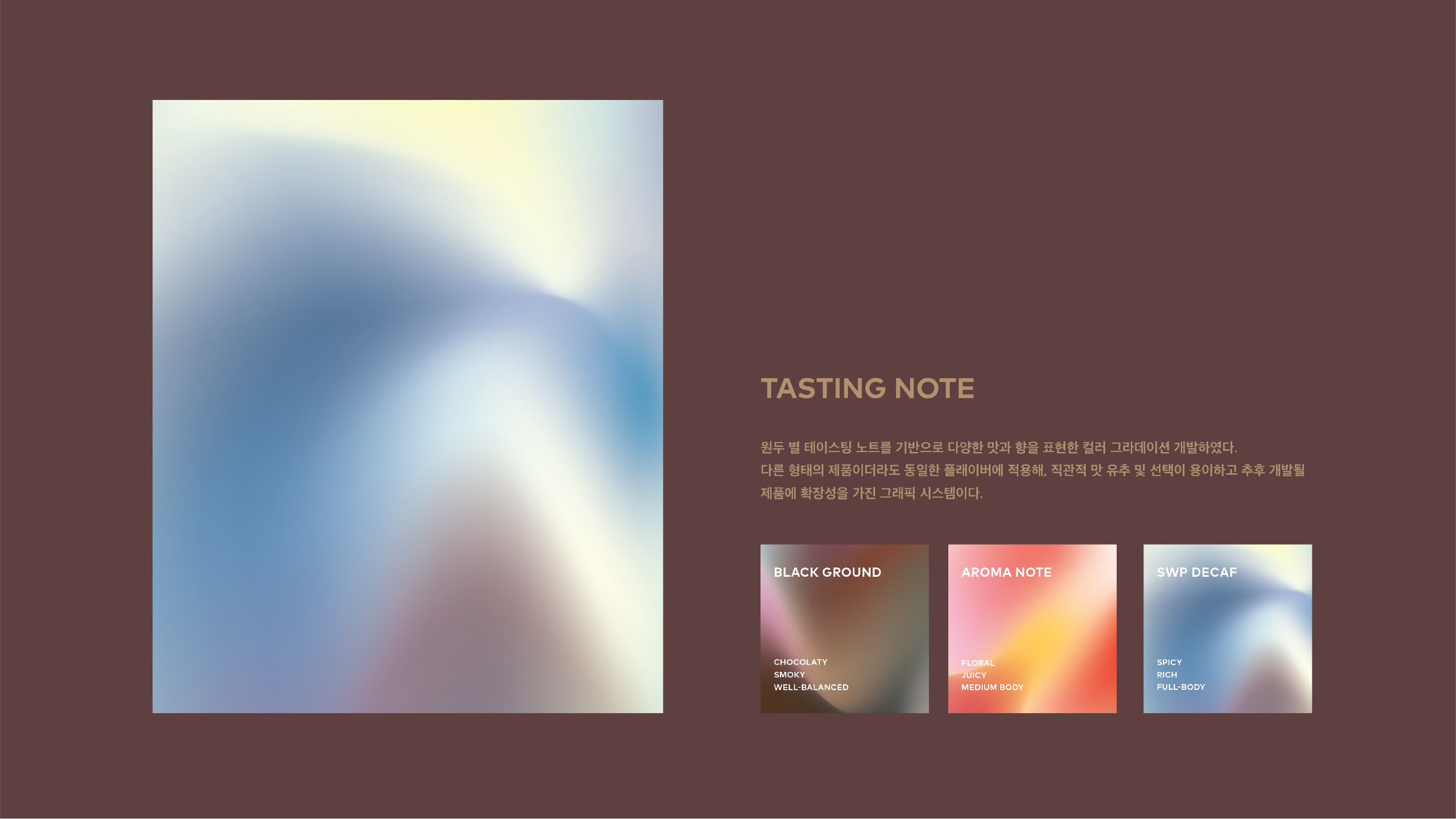
a-LIST by A TWOSOME PLACE
Art Direction & Design
-Brand Identity
-Package
-Printed Material
-Brand Identity
-Package
-Printed Material
Design by
-A TWOSOME PLACE
Design Team
-PROJECT EDDY
-A TWOSOME PLACE
Design Team
-PROJECT EDDY
Korea's leading franchise cafe, A TWOSOME PLACE, has updated the packaging design for its drip coffee in different formats. The brand wanted packaging that helps product expandability in various categories through the use of color, shape, and patterns in a logical graphic system. A gradient square is used to identify the product across categories and stores. A range of colors differentiates various product types. An overarching tone, style, and logical graphics unify the product range.


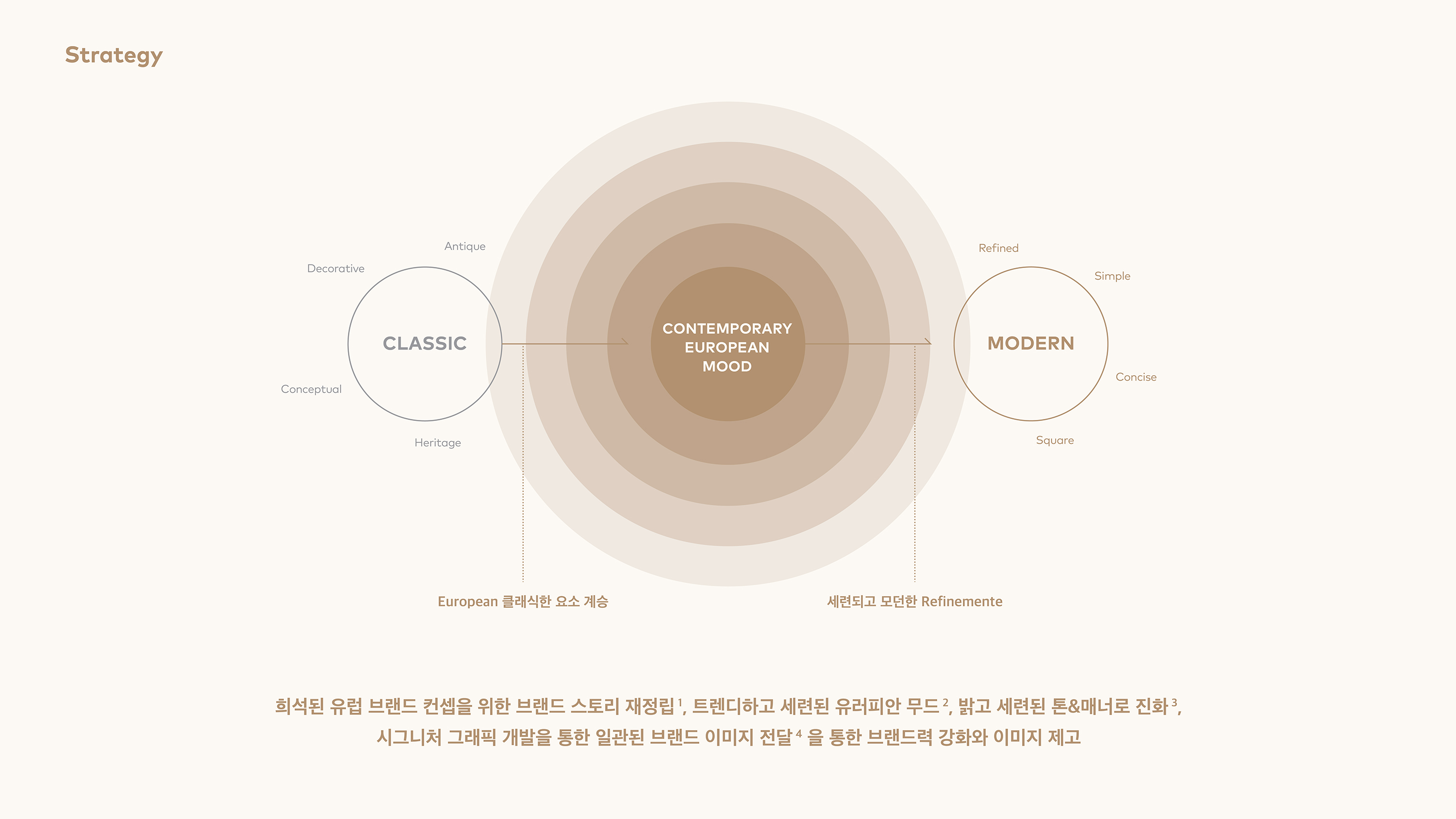
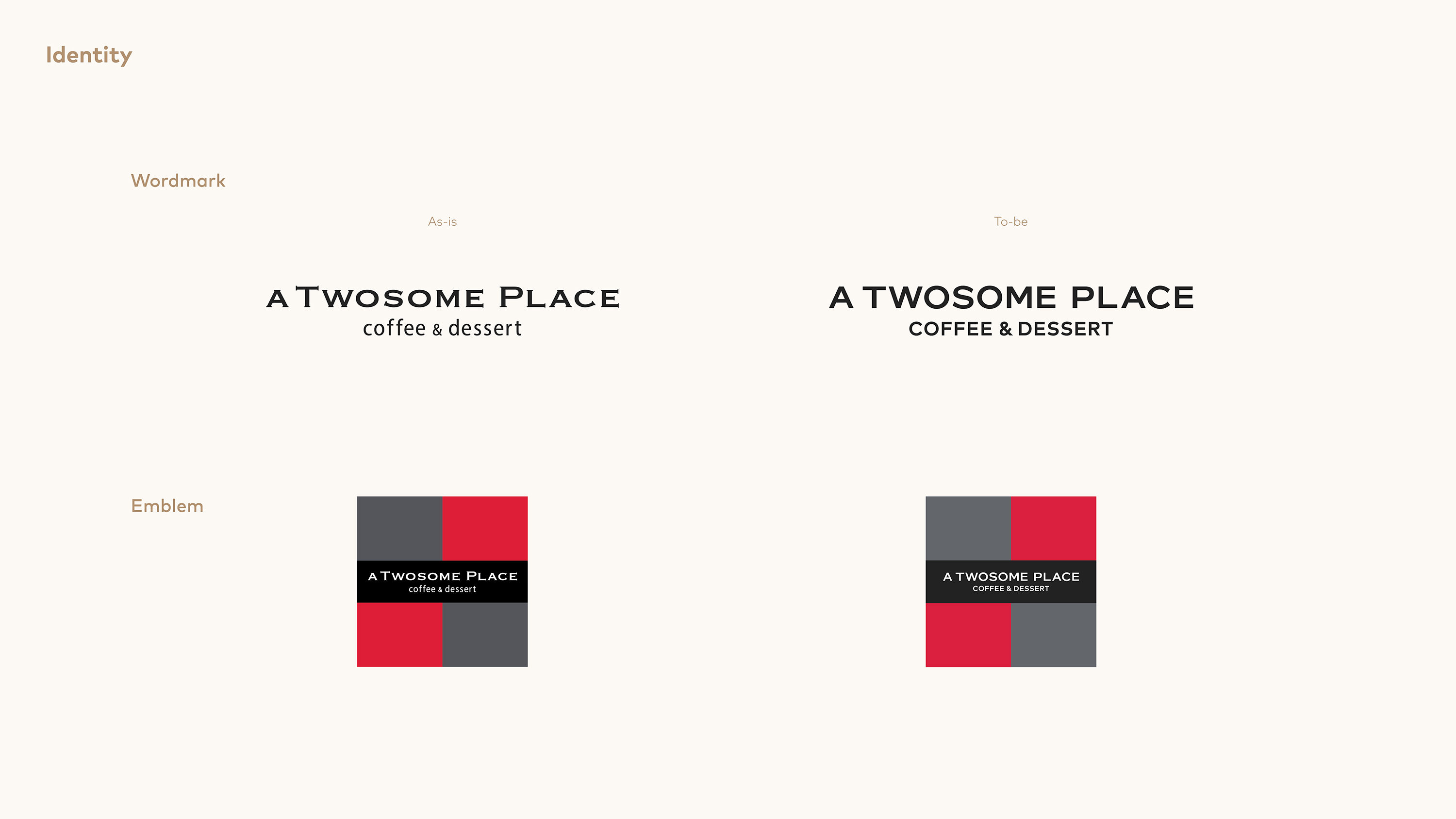
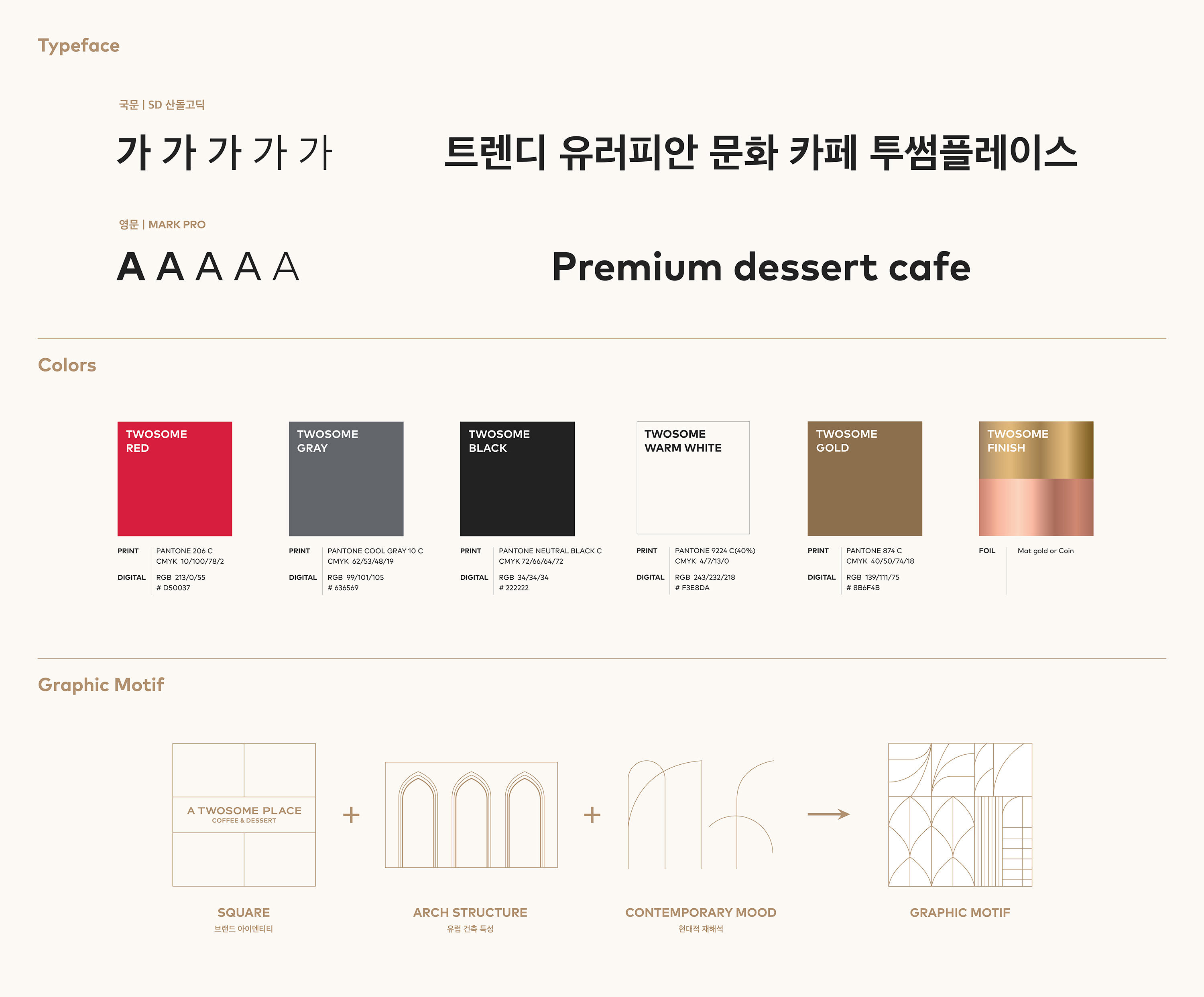
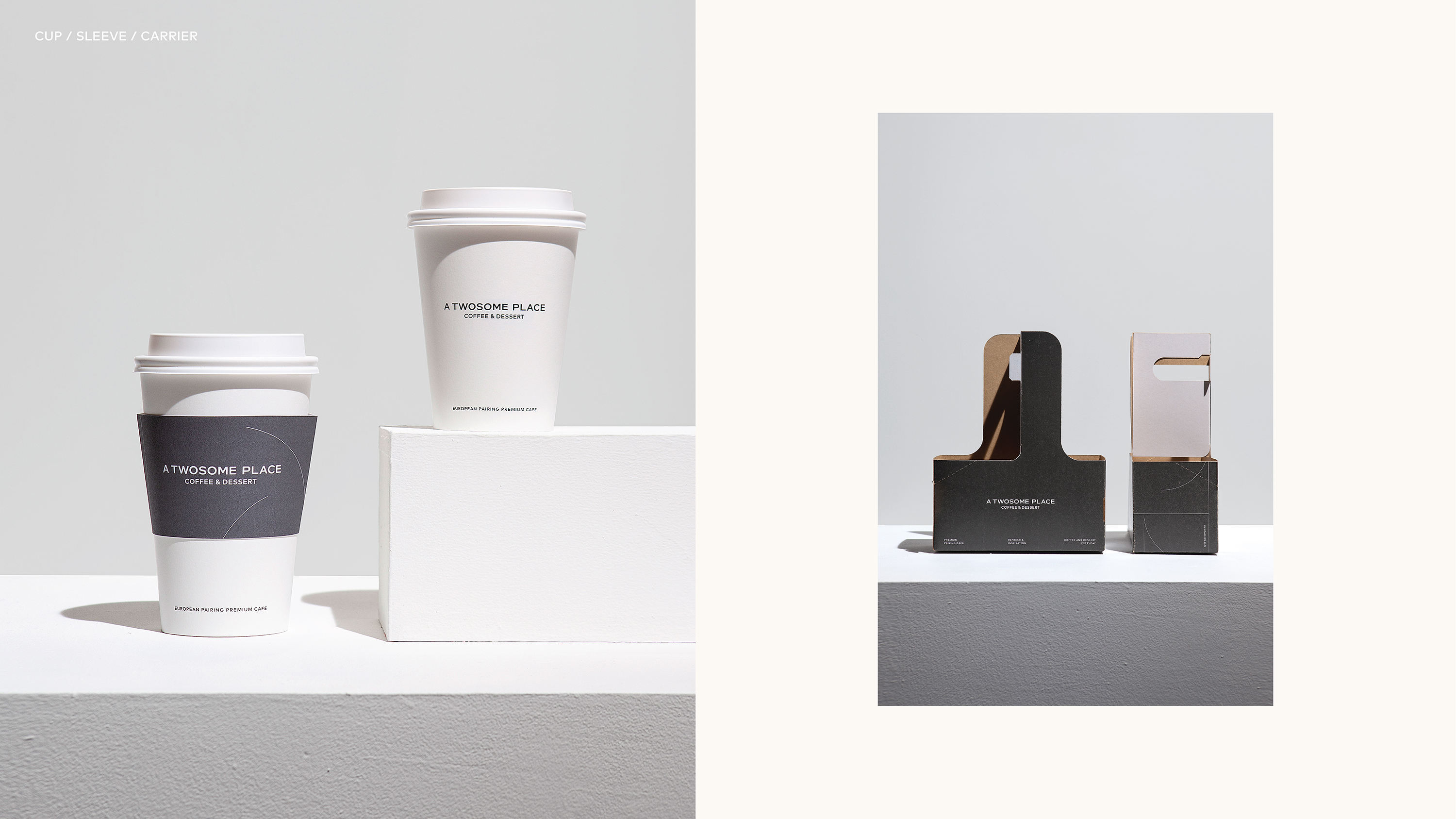
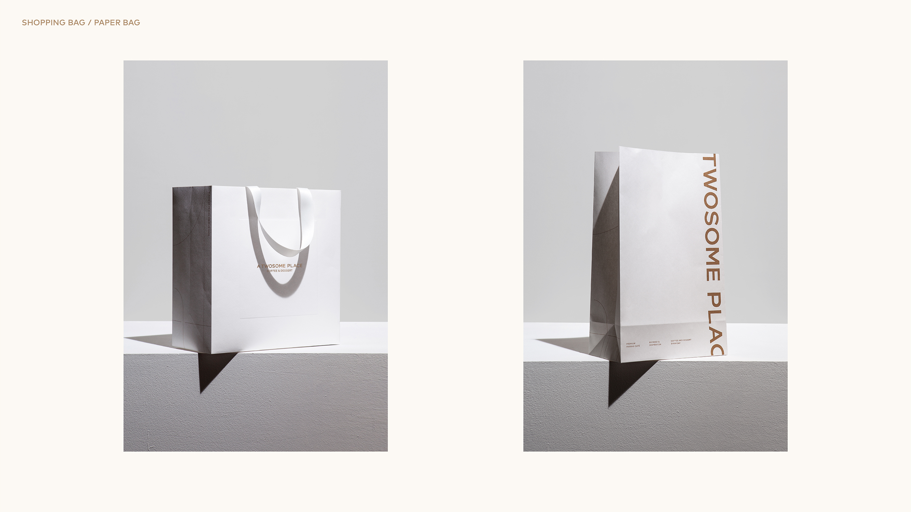
TWOSOME PLACE Brand renewal
Art Direction & Design
-Brand Identity
-Package
-Printed Material
-Design Guide
-Brand Identity
-Package
-Printed Material
-Design Guide
Design by
-A TWOSOME PLACE
Design Team
-CFC
-A TWOSOME PLACE
Design Team
-CFC
Korea's leading franchise cafe, A TWOSOME PLACE, has updated the packaging design for its drip coffee in different formats. The brand wanted packaging that helps product expandability in various categories through the use of color, shape, and patterns in a logical graphic system. A gradient square is used to identify the product across categories and stores. A range of colors differentiates various product types. An overarching tone, style, and logical graphics unify the product range.


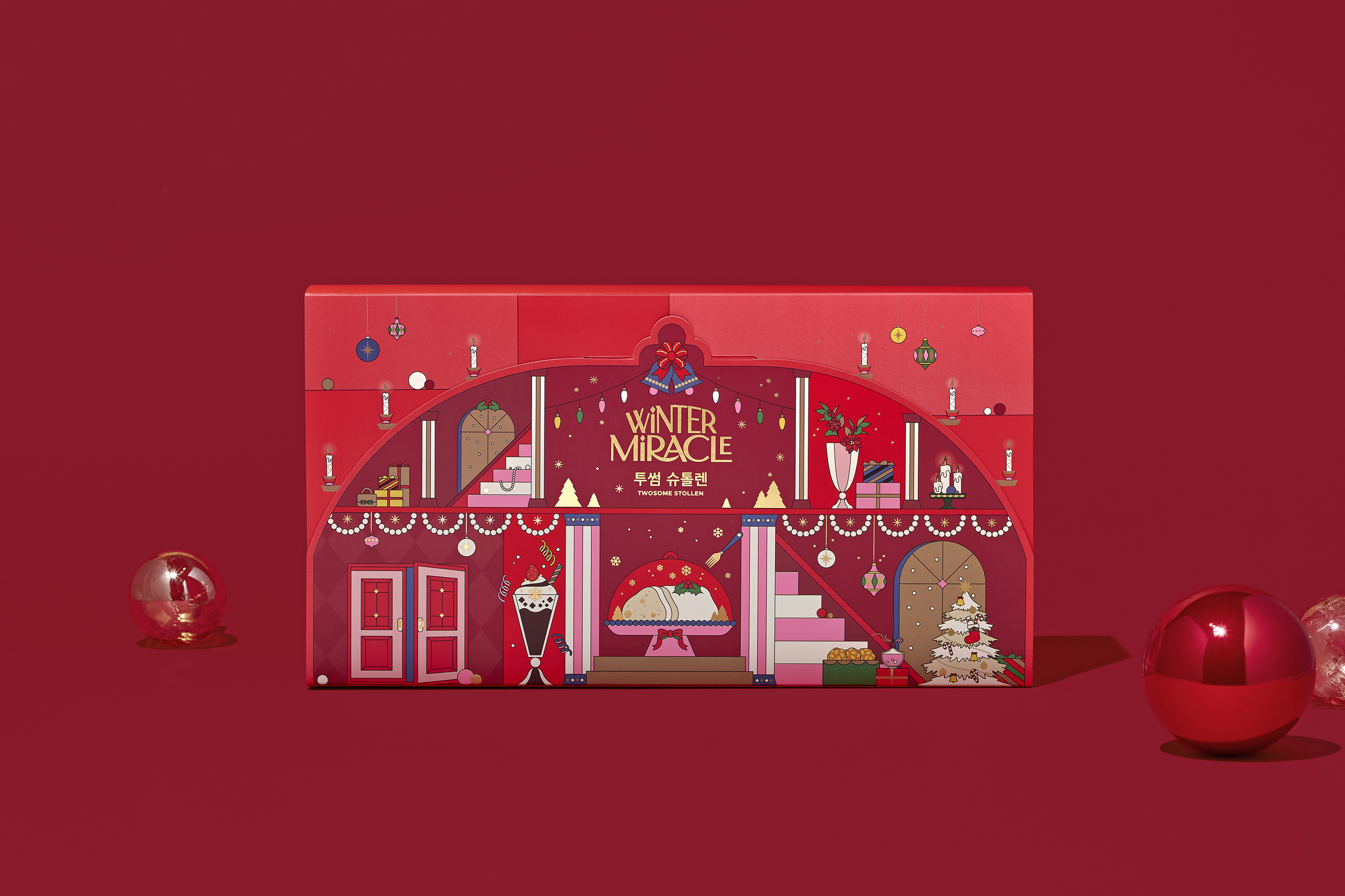
2021 Christmas Collection by A TWOSOME PLACE
Art Direction & Design
-Title
-Package
-Printed Material
-Title
-Package
-Printed Material
Design by
-A TWOSOME PLACE
Illustraion
-oimu
-A TWOSOME PLACE
Illustraion
-oimu
Korea's leading franchise coffee house, A TWOSOME PLACE, has updated the design of its whole bean package. The design is built around the brand's iconic square and a modern and conceptual graph for categorizing its various coffee beans. The horizontal axis stands for acidity while the vertical axis shows the degree of roasting. The size of the square itself represents "body taste.


2020 Christmas Collection by A TWOSOME PLACE
Art Direction & Design
-Title
-Package
-Printed Material
-Title
-Package
-Printed Material
Design by
-A TWOSOME PLACE
Illustraion
-oimu
-A TWOSOME PLACE
Illustraion
-oimu
Korea's leading franchise coffee house, A TWOSOME PLACE, has updated the design of its whole bean package. The design is built around the brand's iconic square and a modern and conceptual graph for categorizing its various coffee beans. The horizontal axis stands for acidity while the vertical axis shows the degree of roasting. The size of the square itself represents "body taste.


